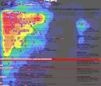
A new study on the observation and usage types of search results and corporate sites gives a few hints that show you how to comment on the search results rankings and how to arrange them so as to enable better and useful content on your site.
The joint study conducted by search marketing firms Enquiro and Did-it and eye tracking firm Eyetools examined the eye movements of users viewing search result pages.
The study found that most viewers looked at results in an "F" shaped scan pattern, with the eye travelling vertically along the far left side of the results looking for visual cues (relevant words, brands, etc) and then scanning to the right, as if something caught the participant's attention.
The researchers called this pattern a "golden triangle" at the top of result pages. The triangle extends across the top natural search result, then angles back to the left of the page down to the bottom-most "above the fold" result, typically in the third or fourth position on the page.
This area was viewed by 100% of the 50 participants in the study.
With both organic and sponsored search results, higher ranking results were viewed more often. Here are results for organic results (percentages represent the number of study participants viewing the listing):
Organic Search Results Viewed:
- Rank 1 - 100%
- Rank 2 - 100%
- Rank 3 - 100%
- Rank 4 - 85%
- Rank 5 - 60%
- Rank 6 - 50%
- Rank 7 - 50%
- Rank 8 - 30%
- Rank 9 - 30%
- Rank 10 - 20%
A similar, though smaller triangle effect was also observed for the sponsored listings on the right side of Google search result pages. In aggregate, fewer people looked at the sponsored listings (google adwords); the exception to this was then sponsored ads were served at the top of a search result page as well as on the right side of the page. Ads at the top of the page were viewed by 100% of study participants.
Sponsored Listings Viewed (right side):
- Sponsor List 1 - 50%
- Sponsor List 2 - 40%
- Sponsor List 3 - 30%
- Sponsor List 4 - 20%
- Sponsor List 5 - 10%
- Sponsor List 6 - 10%
- Sponsor List 7 - 10%
- Sponsor List 8 - 10%

These results are preliminary; a full analysis of the results will be available soon.
"F" shaped scan pattern is replaced by "S" pattern when it comes to institutional sites. It is known that people scan institutional sites by looking with the eye traveling along in reverse "S" pattern on the page. That's why, an institutional site needs to have given enough and interesting information about the company till the eye reaches to the right bottom page beginning from the far left side of the site. The eye scan begins on the left top with the logo of the institution, then it meets the menu on the right, finally after the middle of the pages the eyes scan rapidly, the site needs to possess the actual content on the right bottom. Designed this way, these institutional sites give more time to people while using and makes the data within the site used more efficiently. By reaching more content and information with the help of your site's design, users will leave your site pleased in terms of information about your company.
Institutional sites that Disual designs also made in accordance with the "S" effect. So that, both you and your customers are provided with more efficiency and useful content within the site.

