
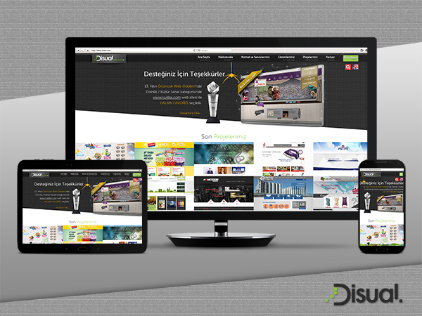
Responsive web designing is an entirely different designing version than traditional web designing. Responsive web design term is related to the concept of developing a website design in a manner that helps the lay out to get changed according to the user’s computer screen resolution.
Web pages of web sites that include data tables pose a special challenge to the responsive web designer. Data tables are extremely wide by default, and when someone zooms out to see the whole table, it becomes too small to read. When one tries to zoom in to make it readable, she is supposed to scroll both horizontally and vertically to look through it. Responsive design eliminates this problem. More precisely, the concept allows for an advanced 4 column layout 1680 pixels wide, on a 1024 pixel width screen, that auto-simplifies into 2 columns. Also, it suitably fixes on the smartphone and computer tablet screen. This particular designing technique we call “responsive design”.A website with responsive design does not require a mobile design. Because, web design can be set automatically according to the mobile screen size.
Now, our website is compatible with all screen sizes. Moreover, our new content management system supports responsive design and it's more convenient and simple. Today, importance of content marketing is growing. That's why the updated websites are more valuable than ever. Contact with us, Let us make your website compatible with all devices.